Adinkra Affirmation Card Deck
BRAND IDENTITY • 3D DESIGN • COPYWRITING • ART DIRECTION • PRINT PRODUCTION • PACKAGE DESIGN • TYPOGRAPHY & LAYOUT
The Adinkra Affirmation Card Deck is a conceptual wellness card series that reimagines traditional Adinkra symbolism through a contemporary lens. Rooted in the visual language of Adinkra symbols originating from the Akan cultures of Ghana and Côte d’Ivoire, the project explores how culturally grounded design can support reflection, mindfulness, and emotional wellness practices.
By pairing affirmations with symbolic storytelling, the deck transforms cultural iconography into an interactive experience centered around growth, self-reflection for intentional modern living. The full system is designed as a 52-card deck — one card for each week of the year — with this featured selection highlighting six symbolic themes.
CULTURAL FOUNDATION
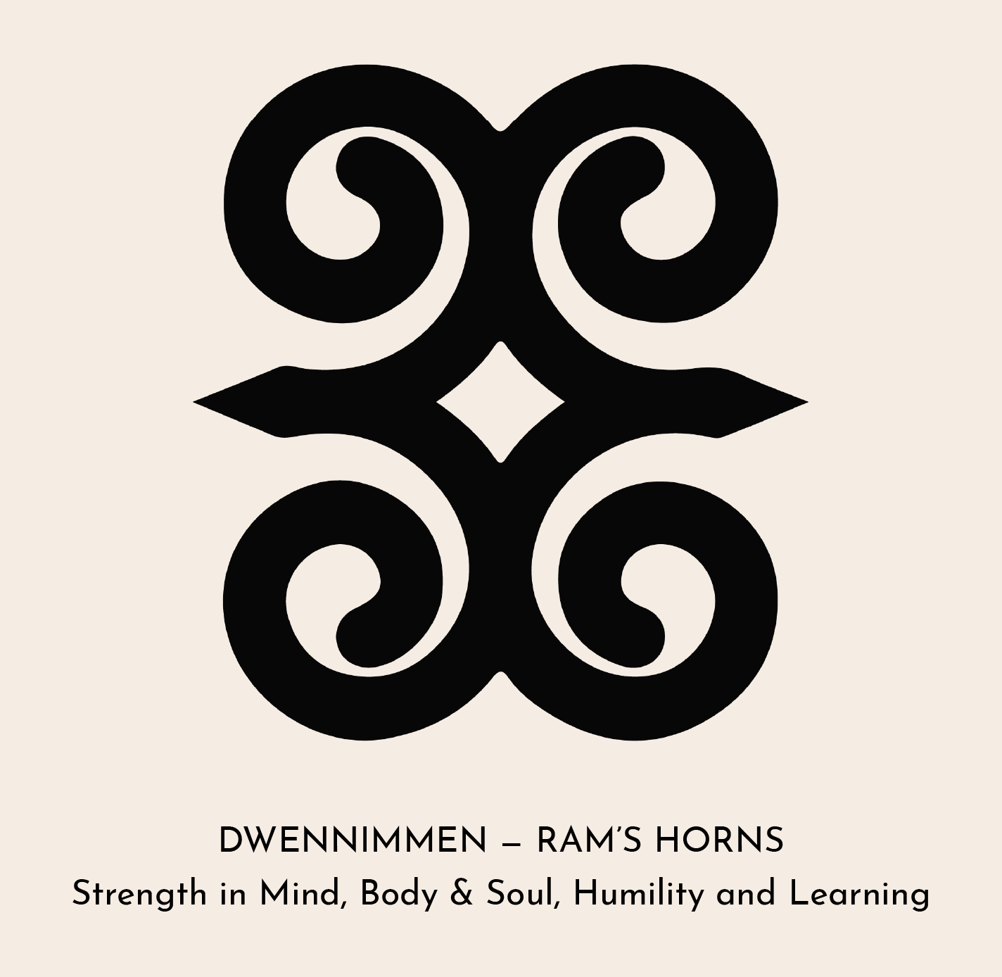
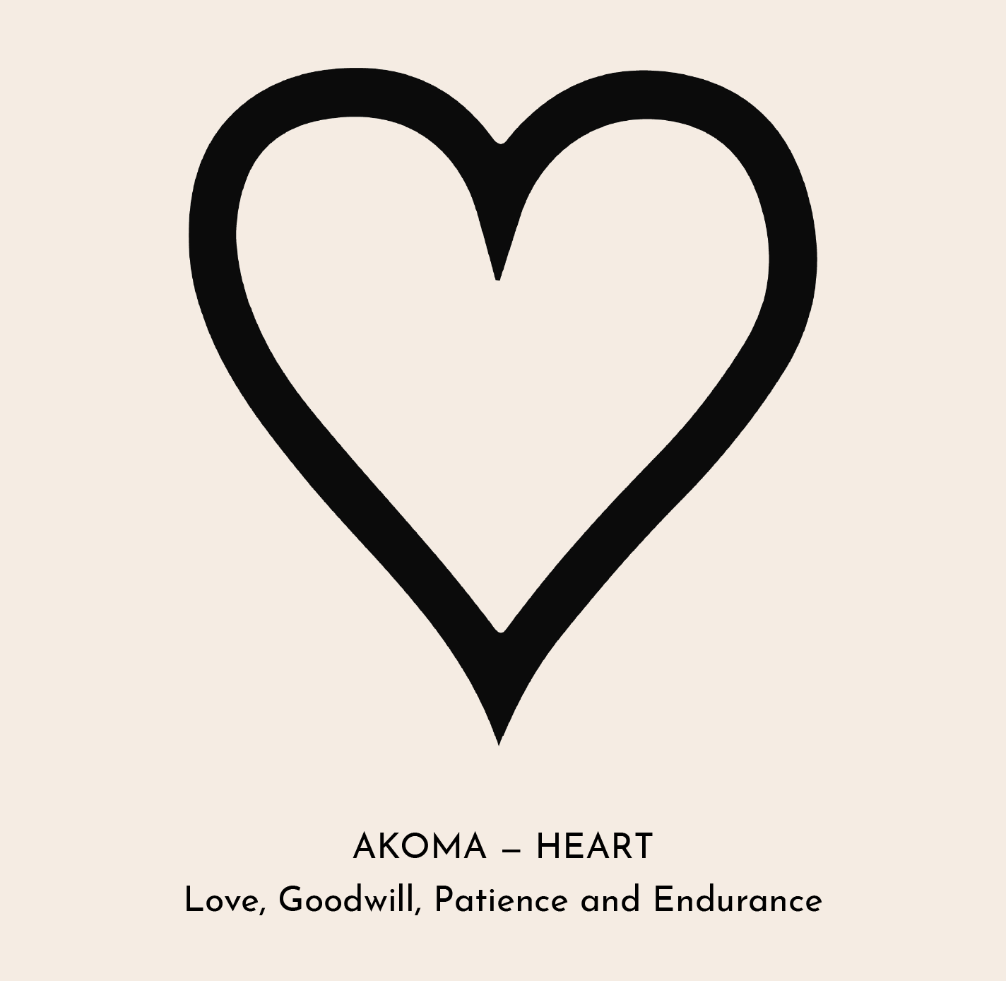
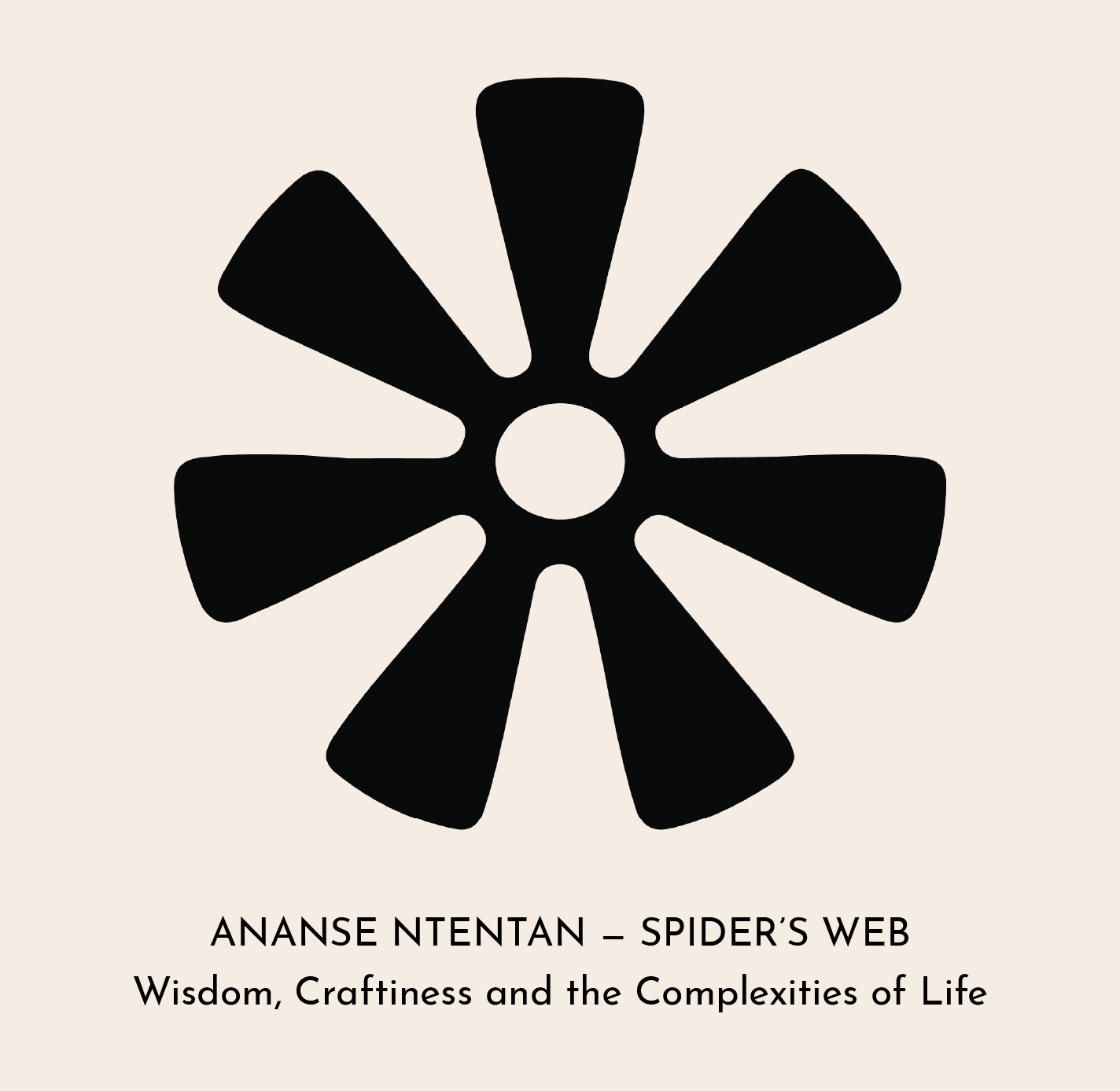
Adinkra symbols are visual symbols traditionally used throughout West Africa to communicate philosophical ideas, values, proverbs, and teachings. Each symbol carries layered meaning tied to concepts such as resilience, love, wisdom, transformation, and spirituality.
This project recontextualizes these symbols within a modern wellness space and introducing them to broader audiences, while preserving their emotional and cultural significance.
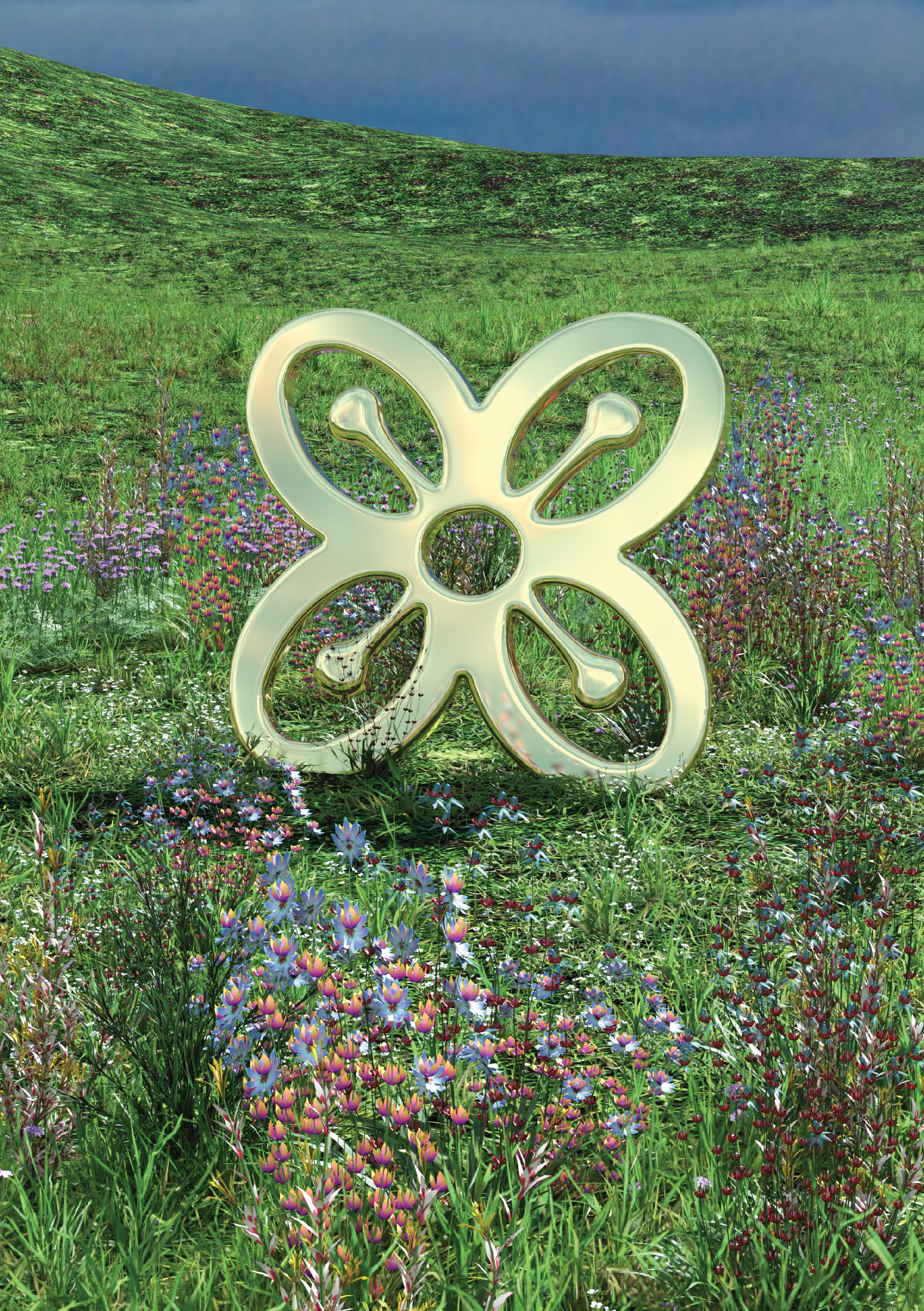
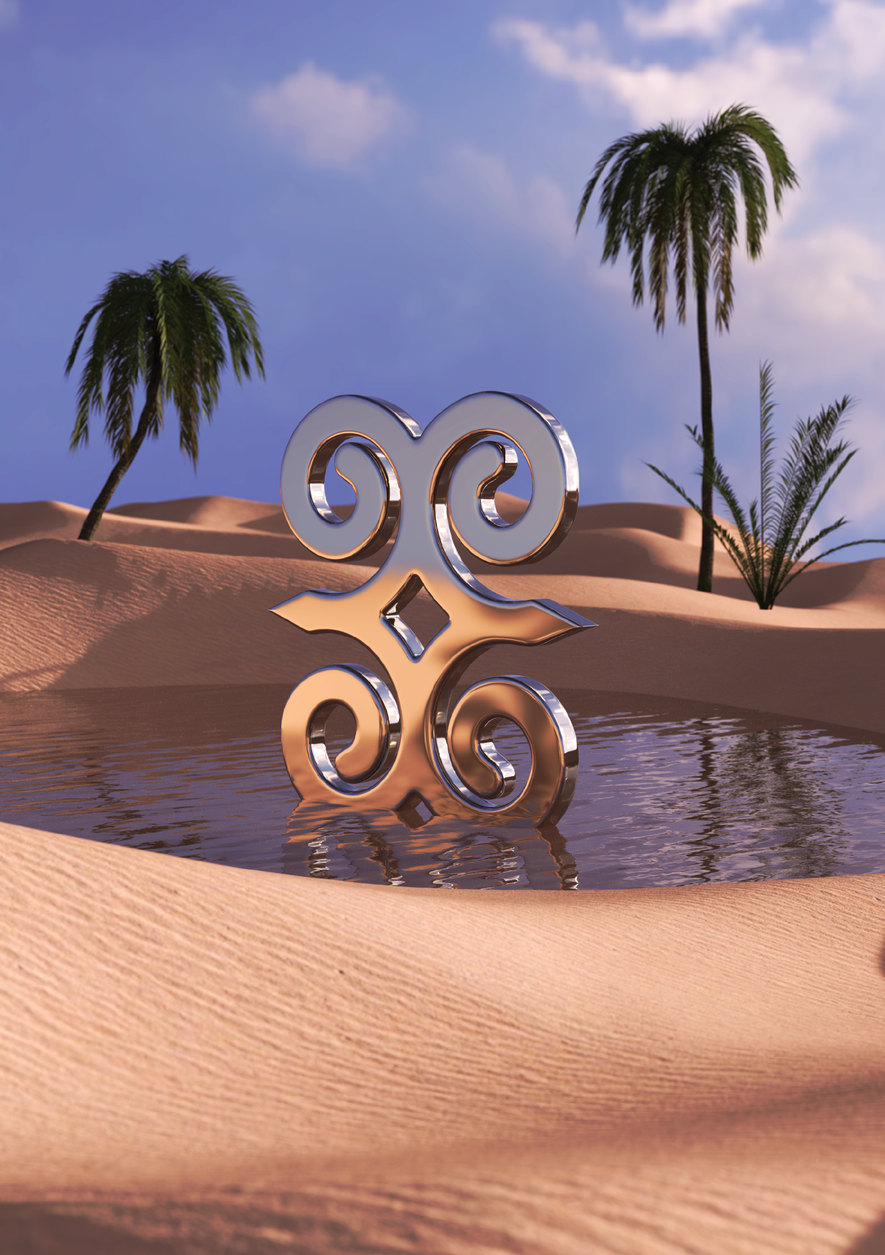
3D SYMBOL REINTEPRETATION
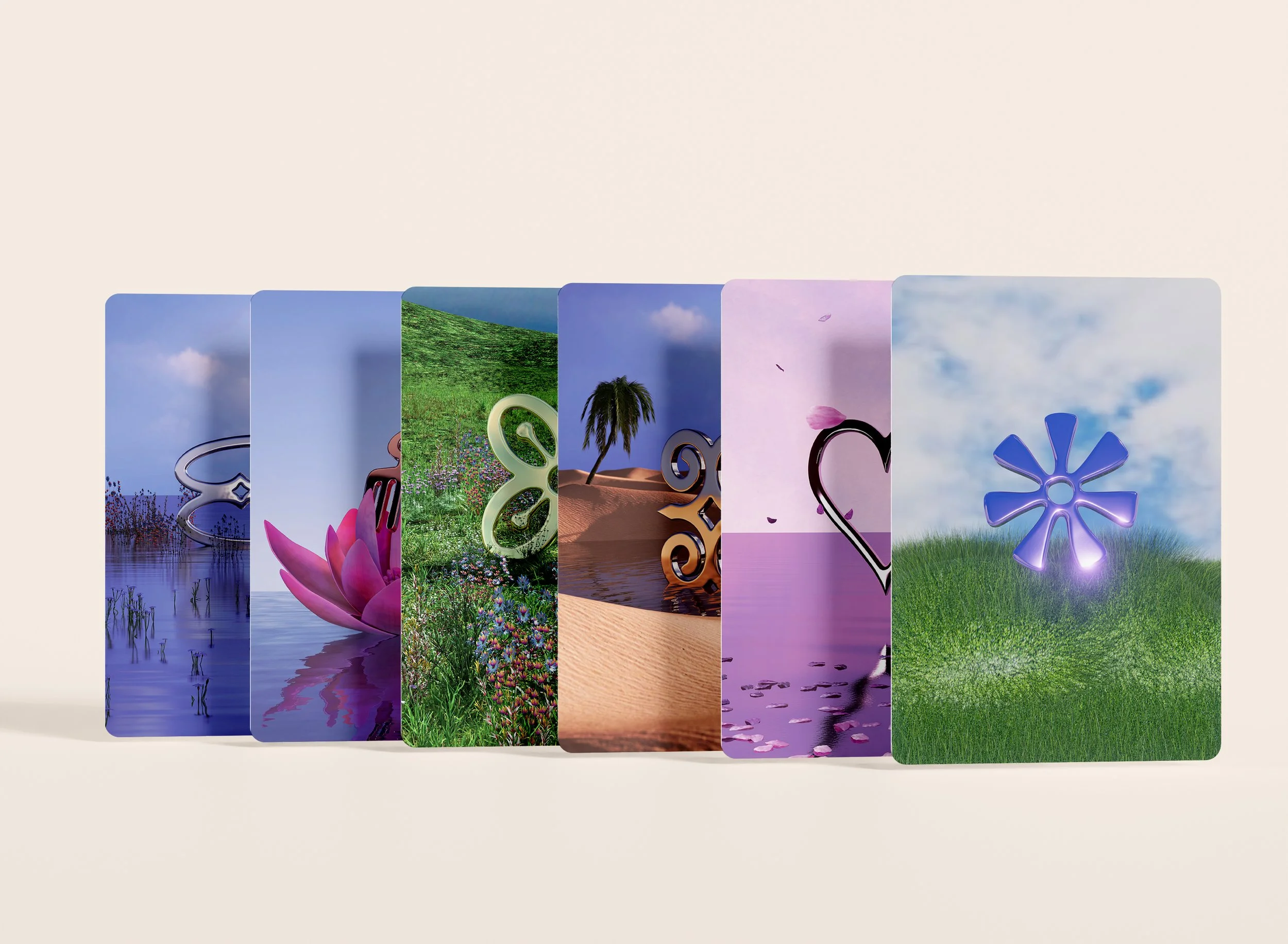
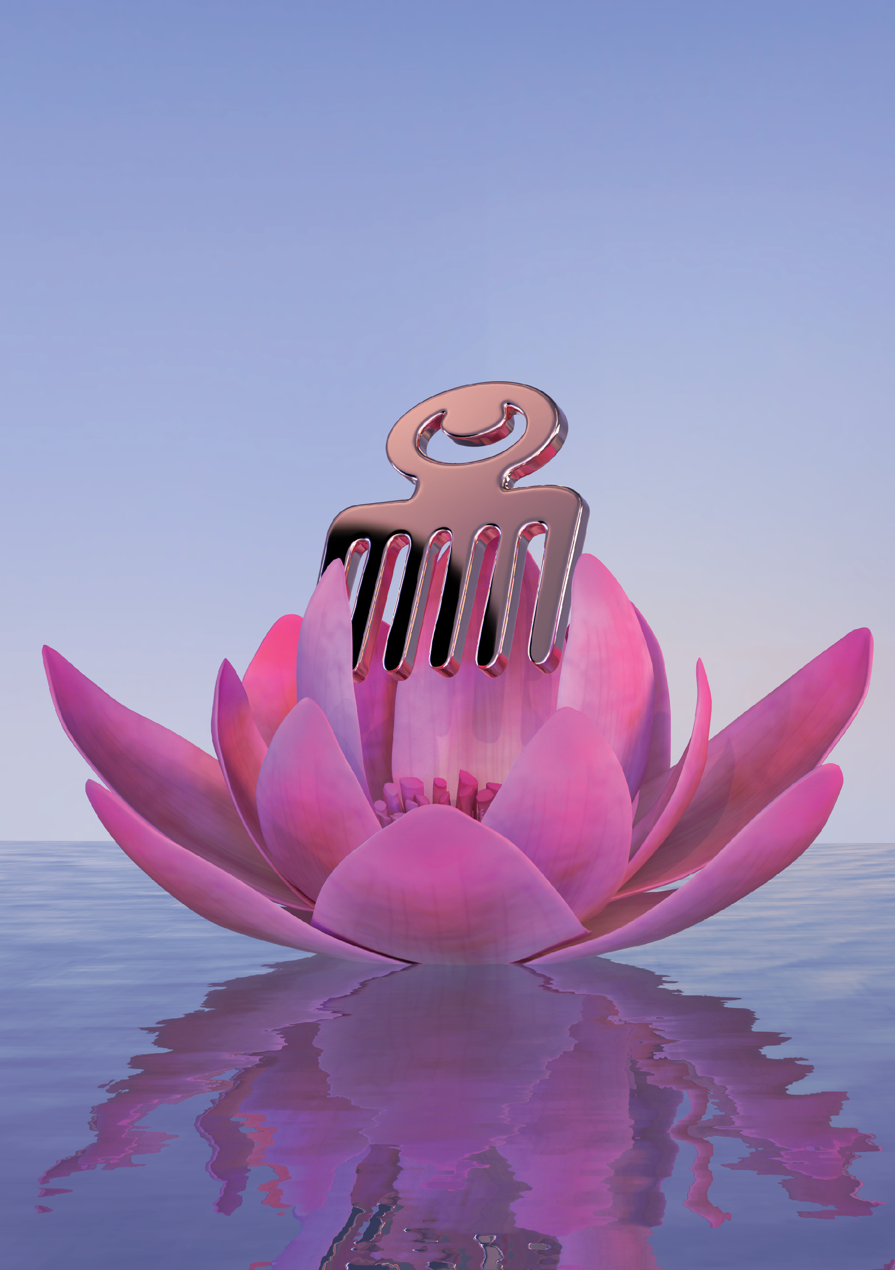
Traditional vector-based Adinkra symbols were transformed into dimensional 3D forms placed within immersive environmental scenes. Each space was art directed around the meaning of its corresponding symbol, using atmosphere, color, lighting, and composition to visually reinforce the affirmation tied to it.
The result creates a more experiential relationship between the viewer and the symbolism by turning static graphic marks into emotionally driven visual worlds.
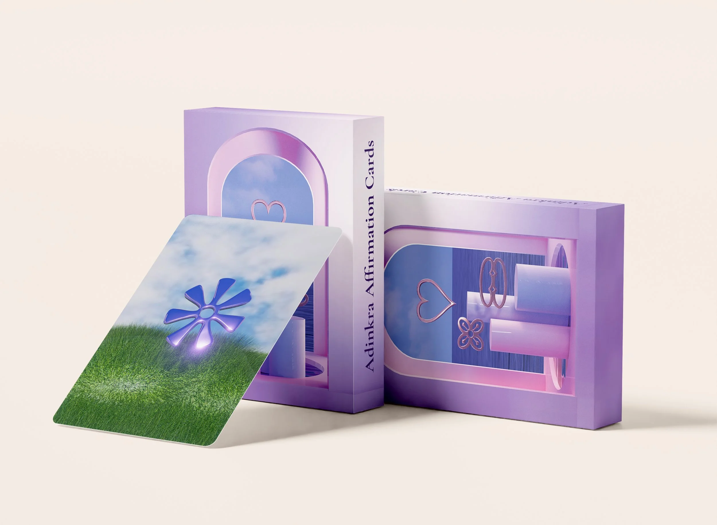
PACKAGING AND VISUAL SYSTEM
The packaging system was designed to feel calm, collectible, and reflective. Soft gradients, sculptural framing, and minimal typography create a visual language inspired by contemporary wellness aesthetics while allowing the symbolism itself to remain central.
Typography and layout were intentionally restrained to support a slower, more meditative reading experience across the deck.
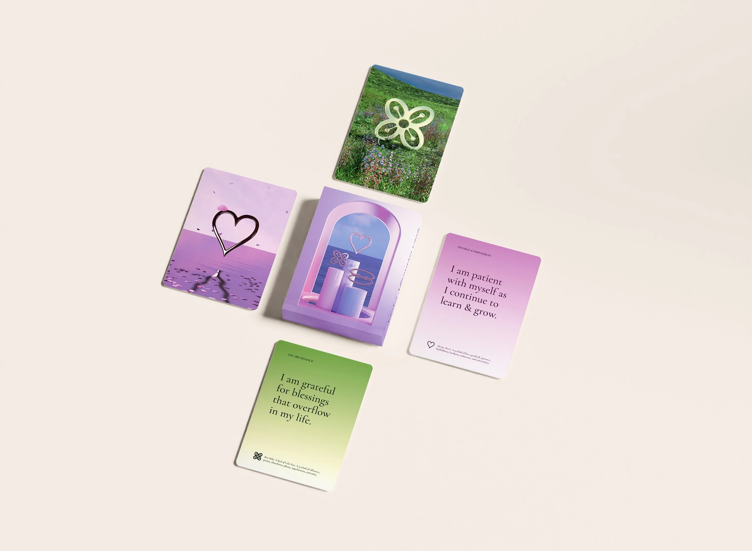
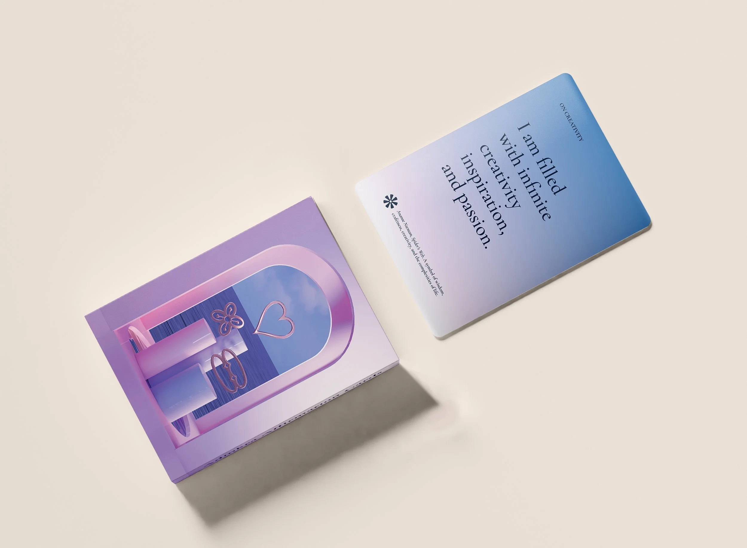
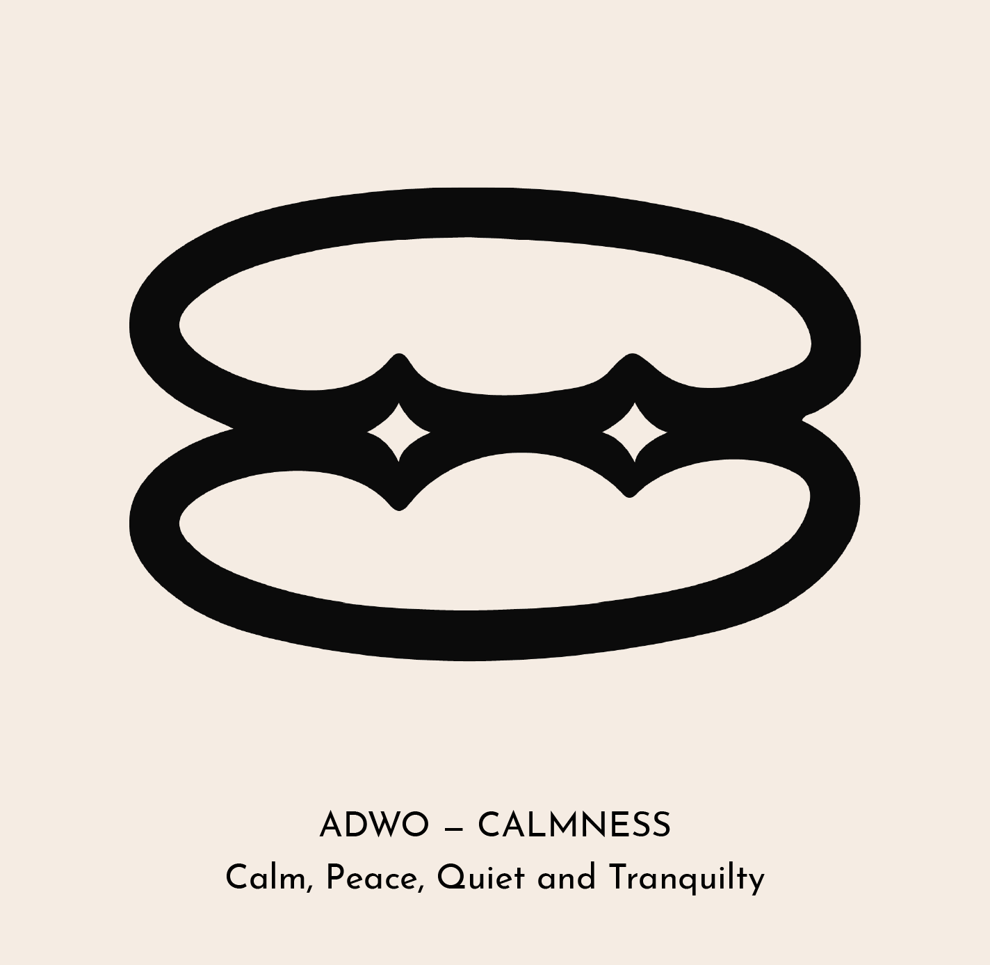
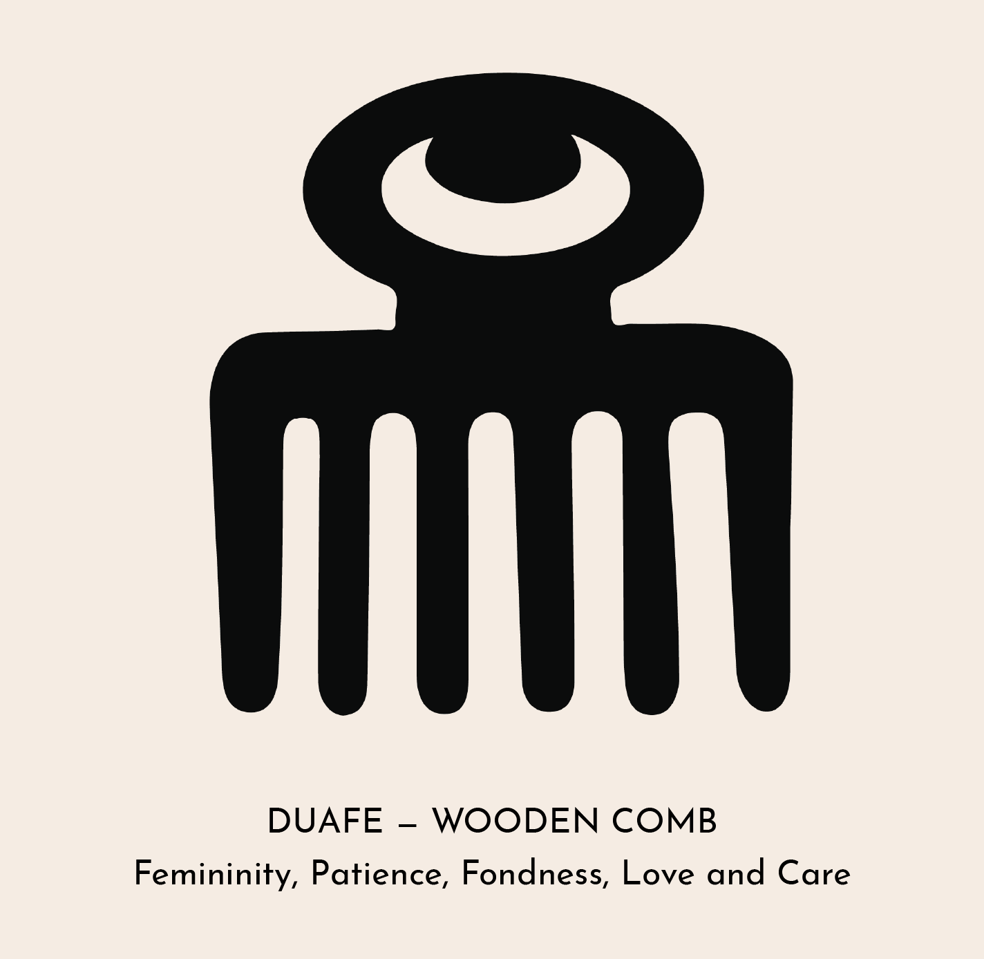
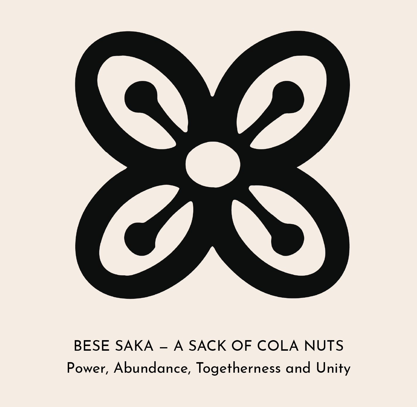
DESIGN ANATOMY

The front of each card was designed to function as both a symbolic interpretation and a standalone art piece. Each Adinkra symbol is transformed into a dimensional 3D form and placed within a custom-built environment inspired by its meaning, allowing the symbolism to feel immersive, emotional, and visually memorable.
The environmental direction acts as a secondary layer of storytelling, helping users intuitively connect visual atmosphere, color, and space with the affirmation’s emotional theme.
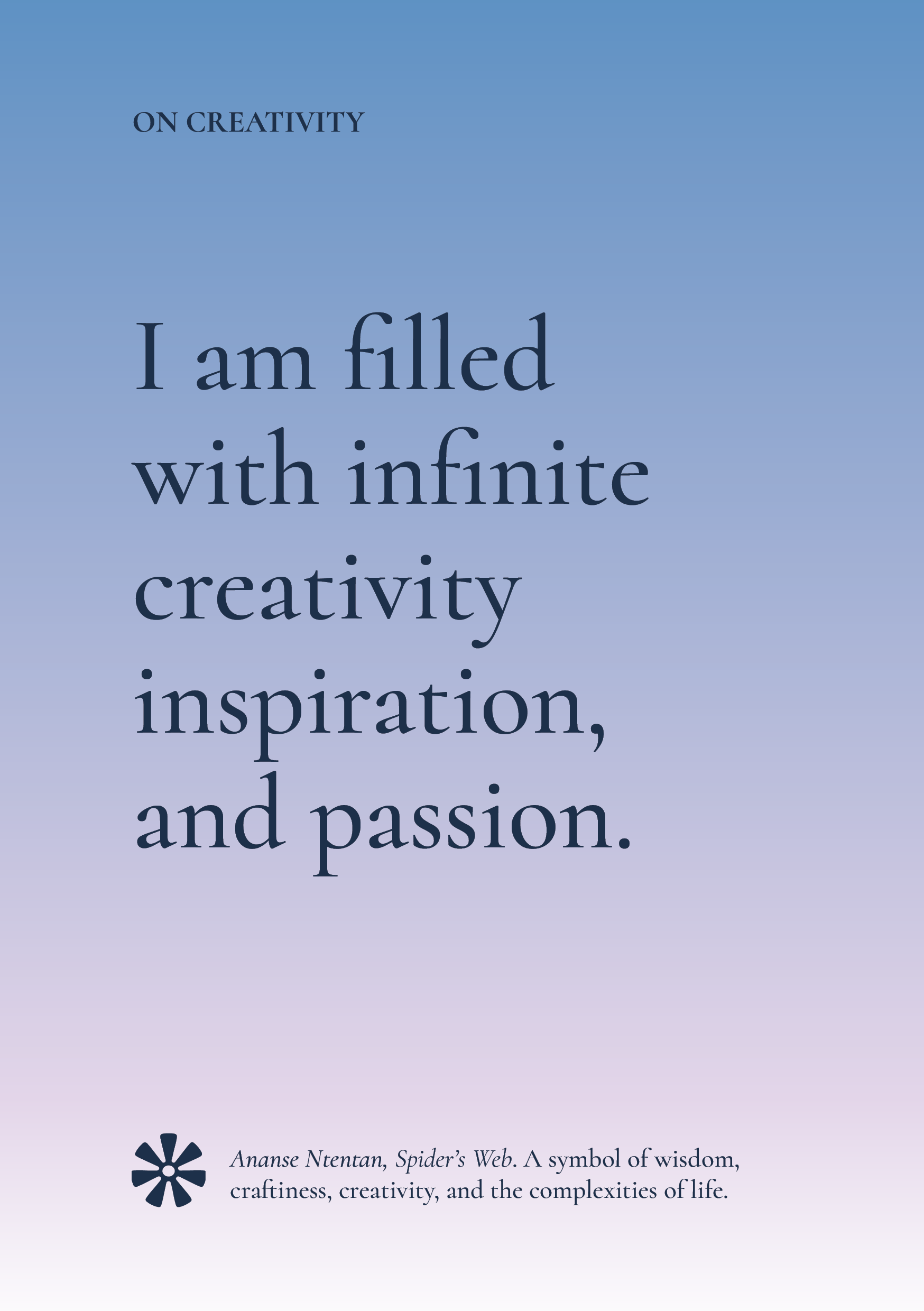
Opening with a thematic header, the reverse side of the cards is designed as a calm, typography-led experience focused on clarity, reflection, and accessibility. Minimal layouts and generous spacing create a slower reading rhythm aligned with the deck’s wellness-centered intention.
Users can choose which side of the card they want on display — the image-based symbolic interpretation or the text-based affirmation and educational context.
The affirmations are set in Cormorant, a serif typeface selected for its softness, elegance, and literary quality. Its refined forms reinforce the reflective tone of the deck while adding a sense of timelessness and emotional warmth.
All text is flush left to support clean visual hierarchy and easy scanning.
—
The bottom lockup provides the original name and meaning of each Adinkra symbol alongside a vector representation of its traditional form. This allows the deck to function not only as a wellness tool, but also as an introduction to Adinkra symbolism for audiences unfamiliar with its cultural significance.


GRADIENT & COLOR SYSTEM
Each card features a custom gradient palette derived from the environmental artwork of its corresponding symbol. Colors were sampled directly from the 3D scenes to create a softer visual extension of the imagery on the reverse side of the cards.
The system creates cohesion across the deck while allowing each symbol to maintain its own emotional atmosphere. Soft tonal transitions reinforce the calm, reflective nature of the experience while visually connecting the immersive artwork with the minimal typography system.