Cerebos
BRAND CONCEPTUALIZATION • BRAND STRATEGY • VISUAL IDENTITY • COPYWRITING • PACKAGE DESIGN • PRODUCT VISUALIZATION
Young adulthood comes with a new pace of life: early mornings, packed schedules, work, class, and the constant effort of learning how to care for yourself in the middle of it all. Cerebos is an organic ready-to-eat cereal brand designed to make one part of that routine feel easy, intentional, and supported.
Centered on brain health and cognitive function, the brand transforms a familiar childhood staple into a more thoughtful everyday ritual for young adults. Balancing playful nostalgia with functional purpose, Cerebos creates a cereal experience that feels bright, approachable, and built for the realities of growing up.
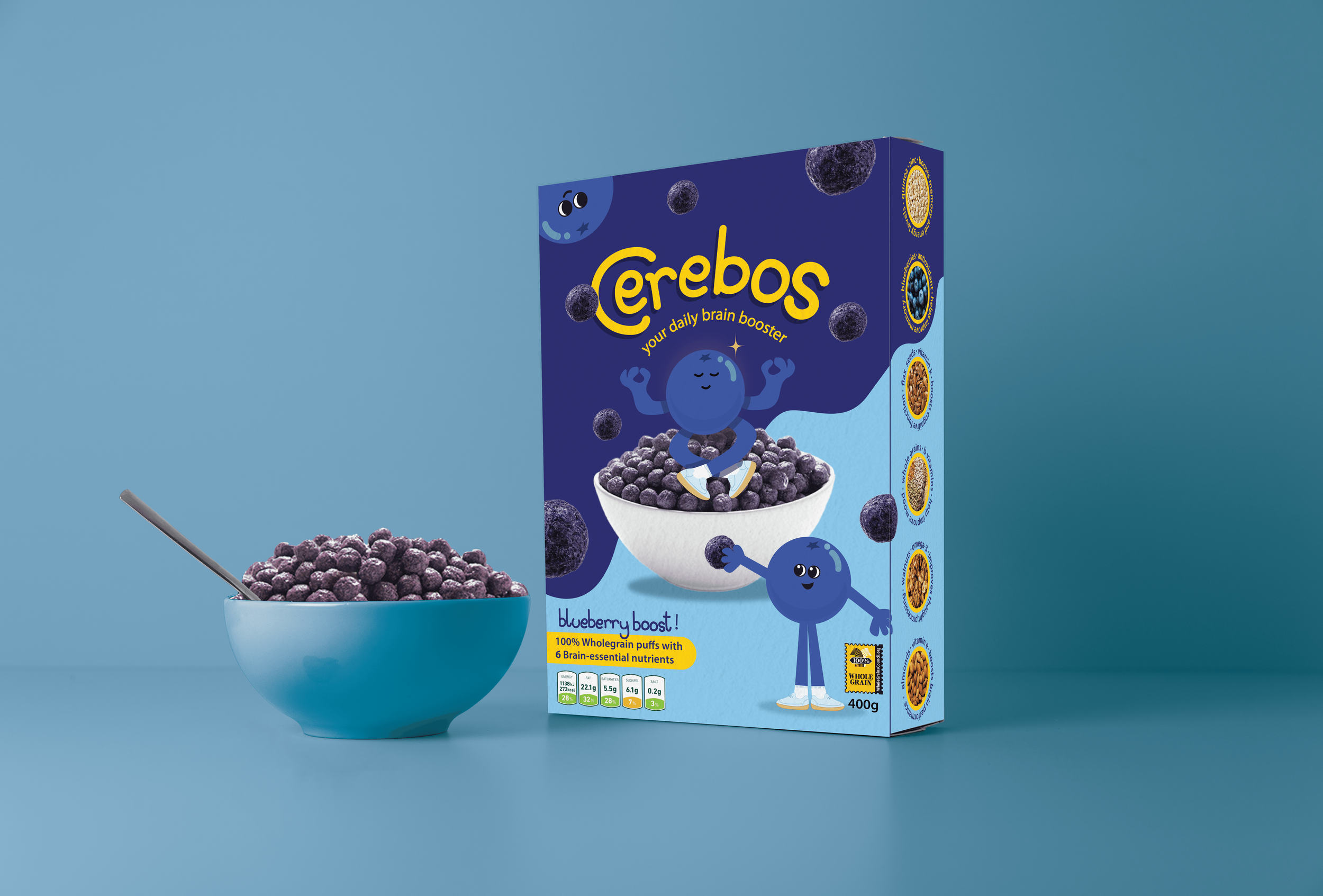
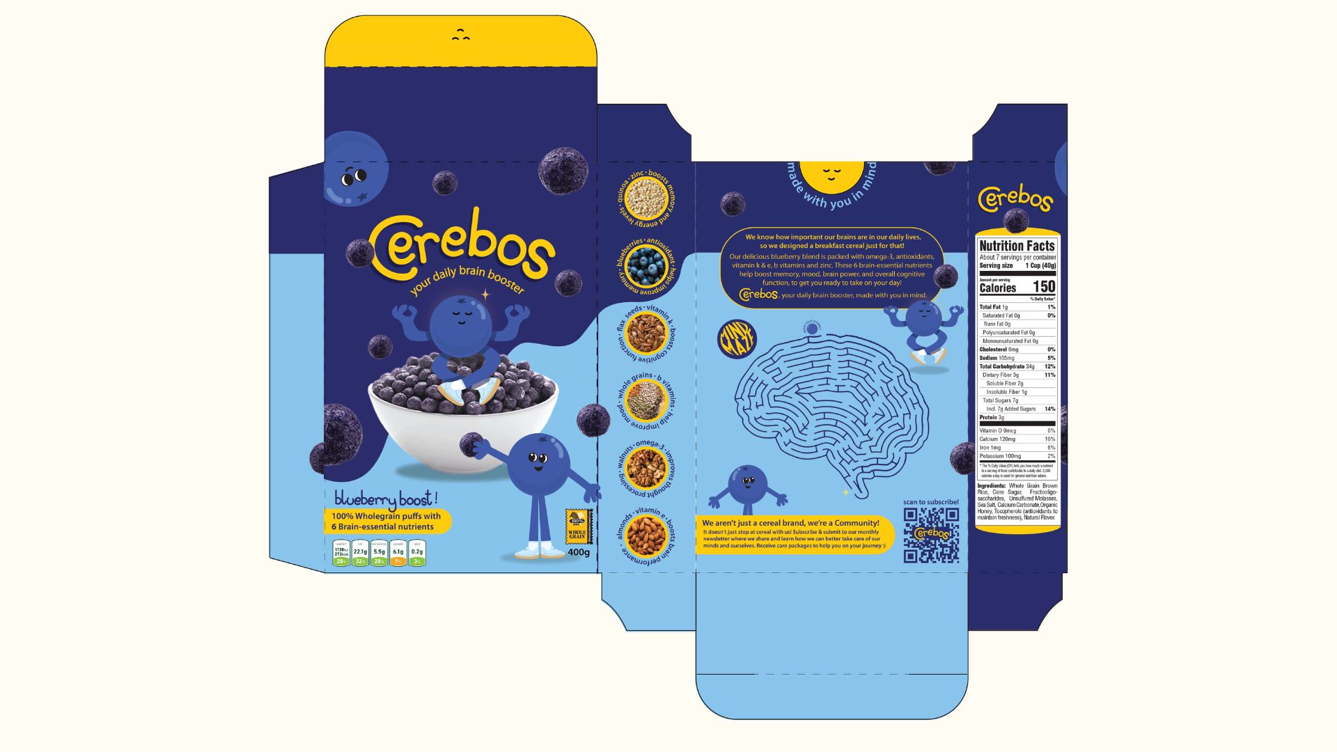
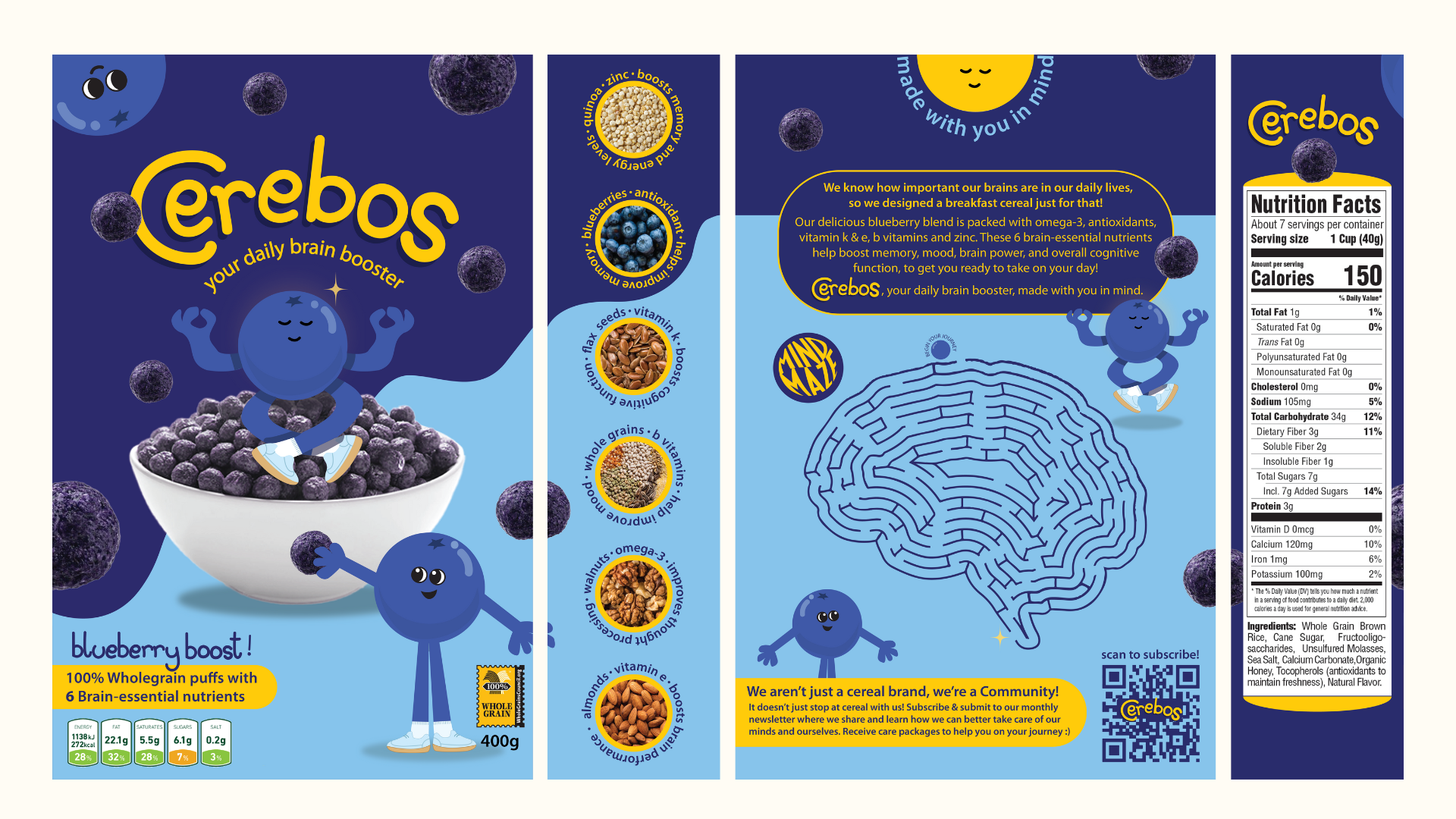
THE CEREAL BOX
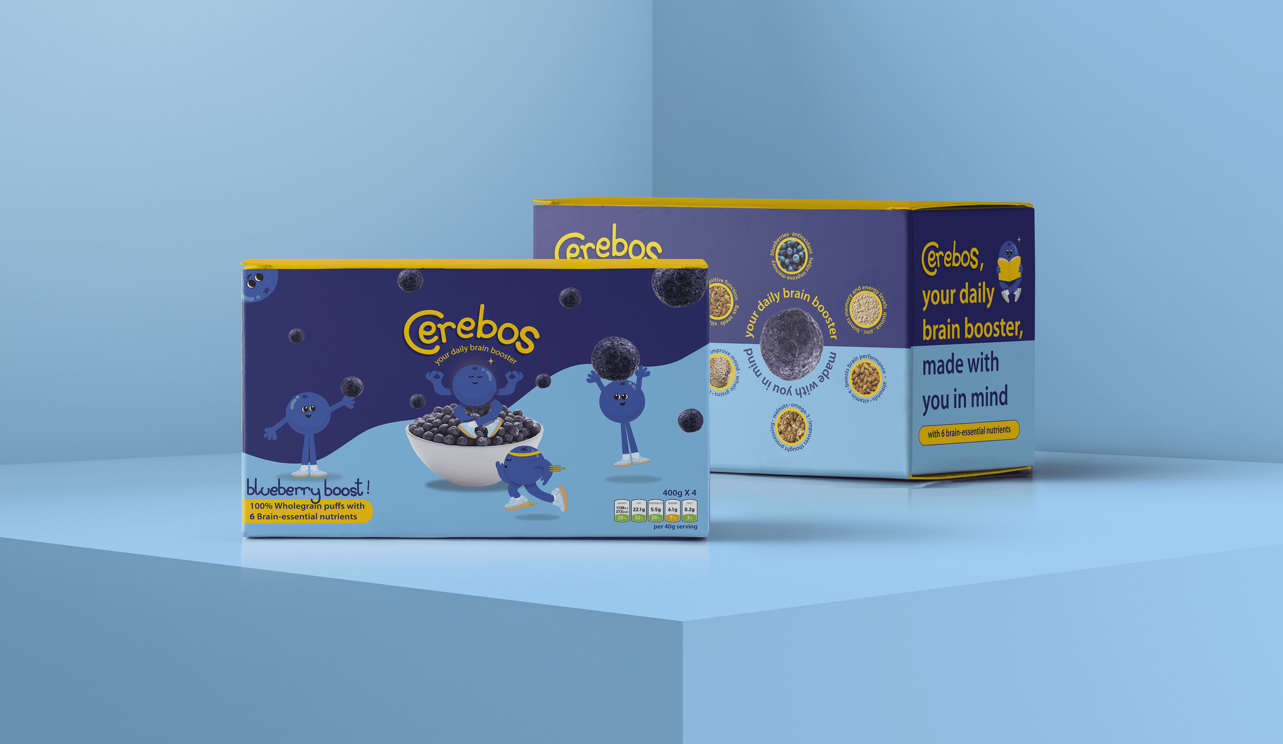
Serving as the hero of the Cerebos identity system, the cereal box establishes the visual tone, personality, and overall direction of the brand. Designed across the front, back, and side panels, the packaging creates a fully realized product experience rather than a single-facing design.
A custom hand-drawn wordmark sets the tone for Cerebos, using soft, imperfect letterforms to evoke the ease and nostalgia of childhood cereal packaging. The front panel builds on that energy through bold color, rounded typography, and character-led visuals, while the side panels organize product and nutritional details. On the back, a brain-themed maze reimagines the interactive fun of classic cereal boxes through the brand’s focus on cognitive function.
INGREDIENTS & FLAVOR DEVELOPMENT
Although Cerebos was developed as a conceptual brand project, the product itself was rooted in intentional research and functionality. Ingredients associated with brain health, cognitive support, memory, and focus were carefully selected while also considering how they would work together to create an appealing flavor profile.
This process led to the development of Blueberry Boost, a flavor concept built around blueberries, quinoa, flax, walnuts, almonds, and whole grains.
The result balances purposeful nutrition with the familiarity and comfort of an everyday cereal.

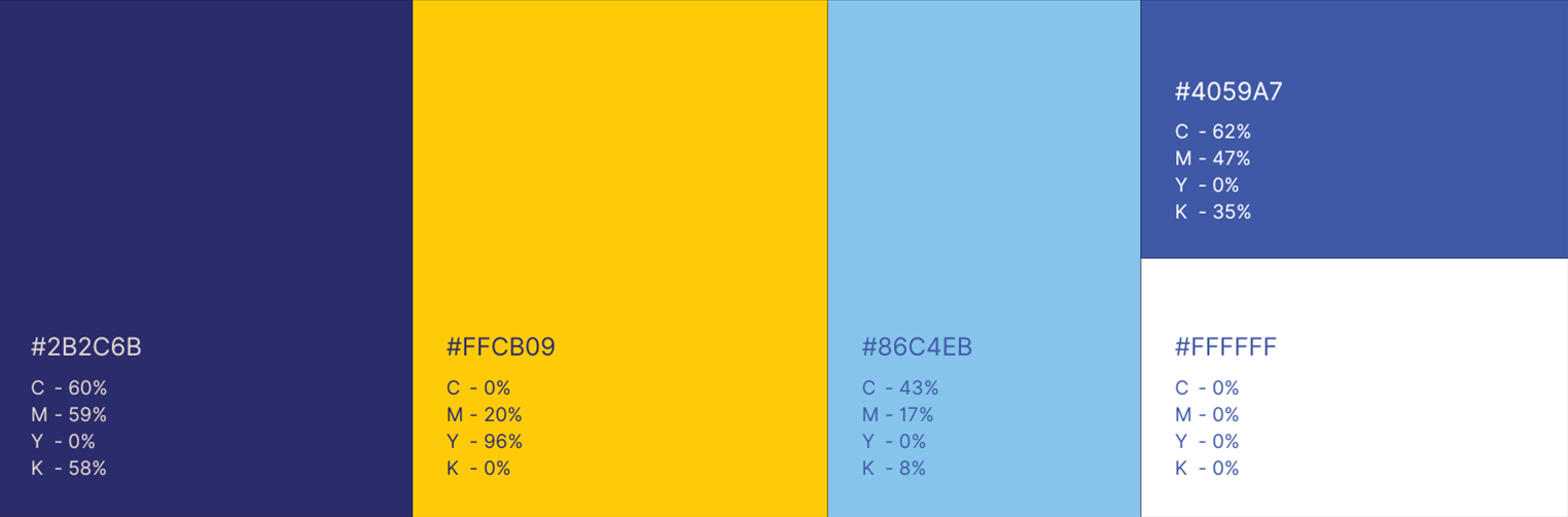
COLOR PALETTE
The palette was designed to feel simple, vibrant, and intentional. Yellow brings energy and optimism, while the blues introduce calm and clarity. Paired with white, the system feels clean, bright, and shelf-ready.
Together, the colors help Cerebos stand out in a crowded cereal aisle while reinforcing its balance of fun and function.
MASCOT DESIGN — THE CEREBOS
The Cerebos mascots personify the brand’s supportive role in young adults’ everyday routines. Friendly and expressive, they add warmth and personality while balancing the functional focus of brain health with playful nostalgia.
Their rounded forms extend the brand’s circular visual language, creating cohesion across the broader identity system.

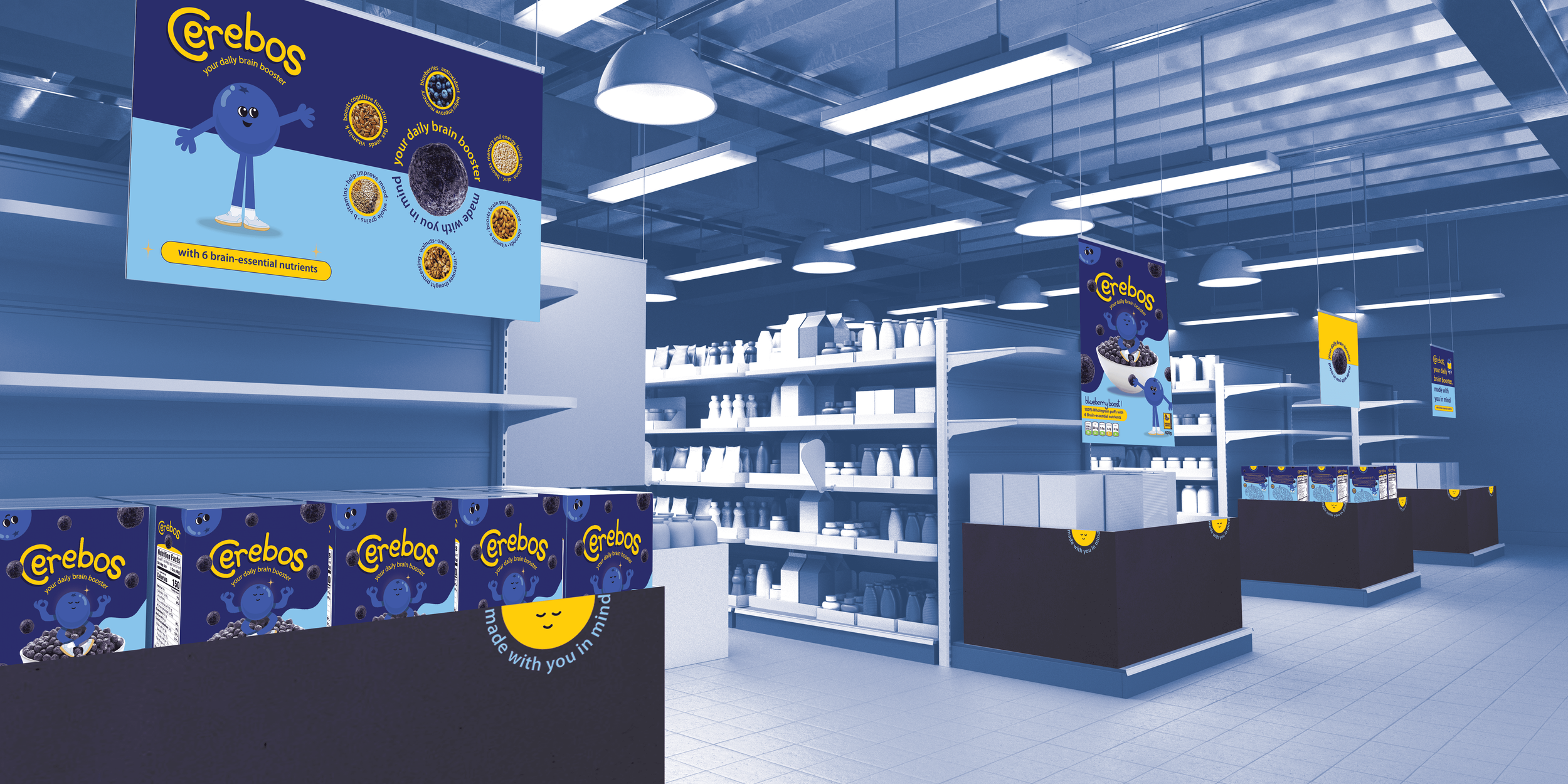
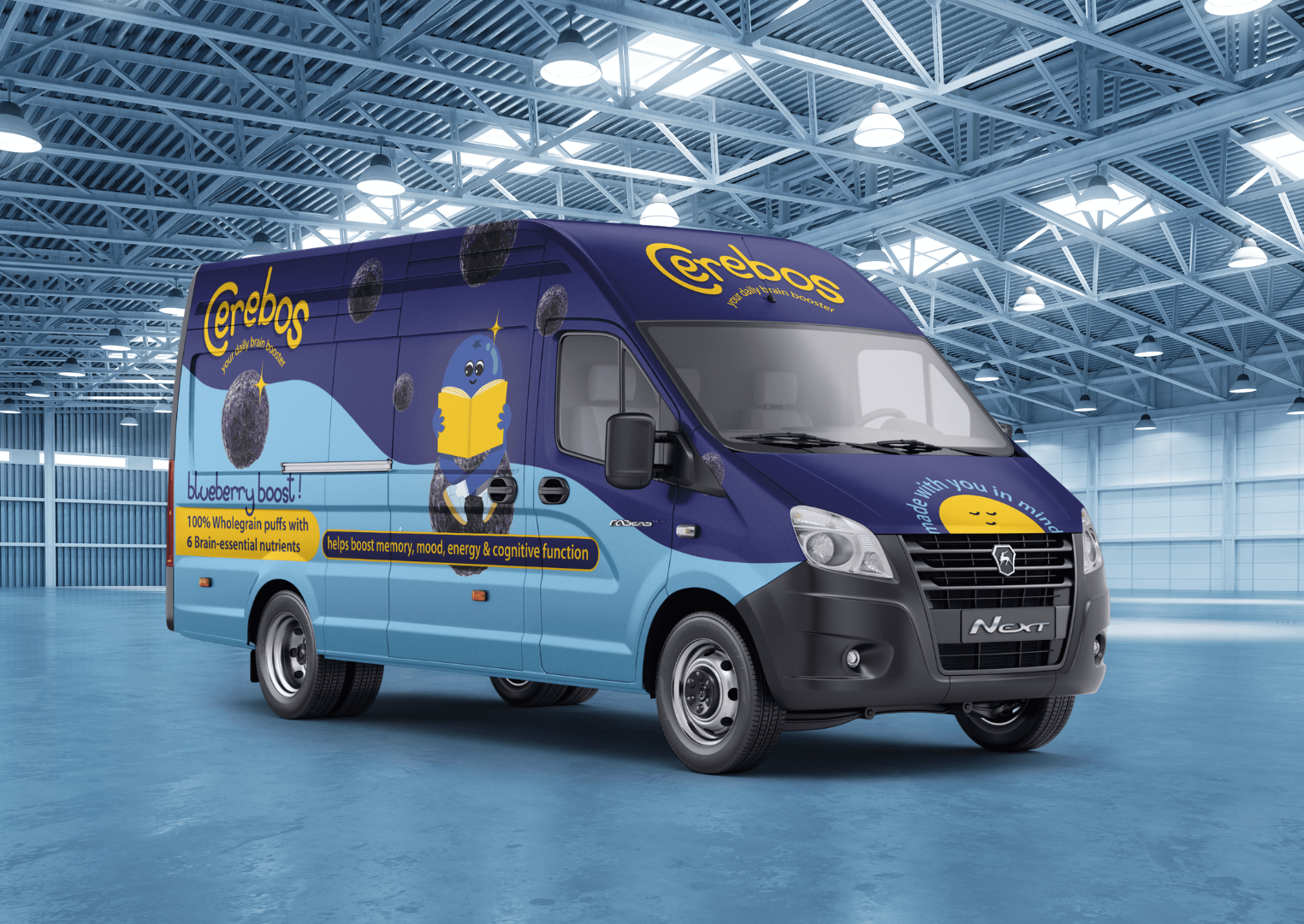
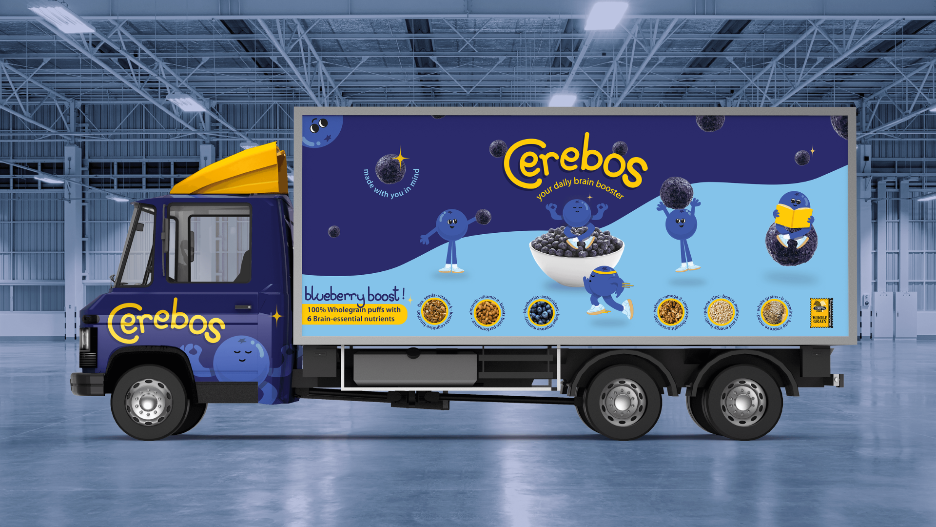
PRODUCT VISUALIZATION
The Cerebos identity extends beyond the box into retail, shipping, and transportation touchpoints. Shelf mockups, branded vehicles, and shipping materials visualize how the system operates as a cohesive, recognizable brand world.
Across each application, Cerebos remains bright, approachable, and built for the everyday rhythm of growing up.